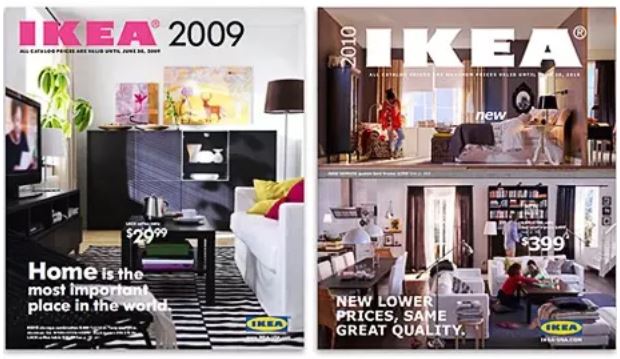
People have been commenting on the change of font used by IKEA for their catalogs since August, when the new catalog came out. IKEA had used the Futura font for 50 years, but made the decision to adopt Microsoft’s Verdana font this year. Apparently, because it translates well to numerous languages. Take a look at the two catalog examples in this picture. Ignoring that the too-busy 2010 cover looks like they are trying to appeal to the attention-deficit generation, the 2010 catalog could be anybody’s while the 2009 catalog is distinctively IKEA. If you took the brand-name off the catalog, you’d know exactly whose it was.

The IKEA Font – Before Vs. After (image via Brandacadabra)
Prior to 2009, the company used Ikea Sans – a variant of Futura – for 50 years. They moved to Verdana because its own-brand font didn’t include Asian characters. But the IKEA front was iconic – and unique. Fans wordwide raised petitions to reinstate it. Which took even IKEA by surprise.
The change is important because design is about more than a satisficing appearance. We tend to mock style over substance, but style plays another role in design. It reinforces the emotional response to artifacts that we have and it provides us with clues (affordances) that tell us how to respond to those artifacts. There is an aesthetic to design that makes the difference between something that is a joy to use and something that just does the job. Sometimes that aesthetic is as simple as the tactile response to a Pilot G2 pen (one of the mundane artifacts that tends to rouse a lot of passion in its users). Sometimes it is the lack of cognitive effort in being able to distinguish the utility of one artifact over another because of its appearance. Sometimes, it is just the comfort of recognizing a familiar artifact, that one knows how to use.
For all of these reasons, IKEA’s decision seems stupid. They had a brand recognition that people would die for, based on the use of the Futura font. Yes, this may be a sad thing to obsess over. But the familiarity and distinctiveness of the IKEA catalog is gone. And I, for one, mourn its passing.
[Note: Ikea changed its brand typeface again in 2020, to Noto, a typeface from Monotype/Google, after a decade of using Verdana. The reason given was that Verdana did not support Chinese characters.]
